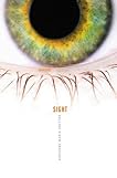
Occasionally, you'll come across two books with rather similar covers. Whether it's completely coincidental, a sign of trends, or a blatant case of biteritus, the question remains:
who did it better?
who did it better?
 vs.
vs. 
The Friday House published June 10, 2008
Sight published October 23, 2007
Last week, on Friday Face Off: The Dark Divine and Bleeding Violet went round for round, with an 11:5 win for...THE DARK DIVINE! Bleeding violet was "way too sexual" and too dark, though The Dark Divine had a close call due to anorexic-looking legs.
Have you seen any cover-twins? Comment with the titles!


I like the Friday House cover better. BTW, my blog is hosting a Free Books January Giveaway, giving away many free books, feel free to participate...
ReplyDeletehttp://mylastread.blogspot.com/2010/01/free-books-january-giveaways.html
O the Friday House.
ReplyDeleteI love it!
I actually prefer Sight. I think the minimalism makes it much more frightening.
ReplyDeleteI have to agree with Rachel on this one. Sight gets my vote!
ReplyDelete