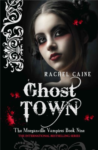
Who did it better?
Last Week on FFO: Two cover versions of the book Once a Witch duked it out; nearly every voter for the original cover praised the "vibrant colors" and in the end, it spelled a win for the original. [See what I did there? Spelled? Once a Witch.. yeah. Yeah.]
;p
*I have been wanting to rant about this for awhile. I'm sorry, EJ Stevens, I'm sure the book is lovely, but "She Smells the Dead" is an awful idea for a title. Just...ick. I mean, come on!


I find the Ghost Town picture really haunting. I can't help staring at it whenever I see it. It feels a bit manga-ish in a way. The other one looks like quite a classic goth pic, but still quite nice.
ReplyDeleteWhich one do you prefer?
I like She Smells the Dead :)
ReplyDeleteshe smells the dead is alot more simple and dosnt have all the white and red on it, the ghost town one is just, chaotic.
ReplyDeleteI won she smells the dead, but I don't like the cover and the font they used for the title. :( So my pick is the Ghost Town.
ReplyDeleteI like Ghost Town a lot better, even if it only were for the title. She Smells the Dead is just a dreadful name for a book. Maybe the story is great but I wouldn't want to be seen reading a book called like that.
ReplyDeleteGhost Town for me. Though, she smells dead seems a bit more likable with that cover...but what an awful title!
ReplyDelete