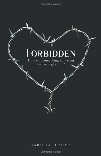
We've already seen this cover of The Dark and Hollow Places when it faced off against itself. But the other day, I came across something that looked startlingly familiar... Yes, I had seen this fearsome heart before...
So what do you guys think? Which makes you want to pick up the book more? Would either of these catch your eye in a store?
Which one did it better?
http://www.thebookrat.com/2011/04/friday-face-off-nightshade-series-v.html>Last Week on FFO: Most of you hated the new covers for Nightshade and Wolfsbane, and many of you wondered just what Calla is doing... But some of you liked 1/2 of the old set and the other 1/2 of the new set, so it was a toss-up. But in the end, the ethereal, pretty old covers won out easily over the sleek but blah urban fantasty style new covers.


I like The Dark and Hollow Places cover better.
ReplyDelete+JMJ+
ReplyDeleteThe Dark and Hollow Places has a more intriguing, interesting cover. There's much more going on because of the blood. It makes me think the story has more dimensions.
The Forbidden cover here is way too bland. There's not enough to catch my interest. By a long shot, The Dark and Holllow Places.
ReplyDeleteDefinitely The Dark and Hollow Places cover.
ReplyDeleteThe Dark and Hollow Places for me too. the thorniness stands out more.
ReplyDeleteThis one is actually tough for me. I like both, but in the end, Forbidden > The Dark and Hallow Places. I really like the simplicity of Forbidden.
ReplyDelete- Jackie
I'm surprised to admit I like the second one best. Despite the blood it's softer than the black background.
ReplyDelete