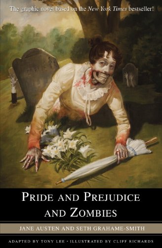
"Pride and Prejudice and Zombies" - a fiendishly clever mash-up of Jane Austen's beloved classic with all-new scenes of zombie mayhem - is "A New York Times" bestseller and a major pop culture phenomenon. This graphic novel adaptation, featuring all-original art, will bring this sensational tale to a whole new audience. 'It is a truth universally acknowledged that a zombie in possession of brains must be in want of more brains'. So begins "Pride and Prejudice and Zombies" - Jane Austen's immortal classic, now brought to glorious, gory new life with original, all-new scenes of zombie mayhem. Seth Grahame-Smith's irreverent and witty reworking of this novel immediately struck a nerve: The book quickly became "A New York Times" bestseller - and one of the most buzzworthy and blogged-about pop culture sensations of the year. Now "Pride and Prejudice and Zombies" is a graphic novel - the perfect format to bring this remixed masterpiece to zombie-loving pop-culture fans.
Notes:
If you've read my review of Pride and Prejudice and Zombies (not the rest of the series, just that particular book) you'll know I was not impressed. We are not amused. But that was not so much a fault of the story as -- well, we won't get into all that. But long story short, it basically meant I was not opposed to trying the story again in a different format. And I have to say, this did work for me much more than the novel did. Zombies are meant to be seen, I think. And the black and white illustrations were striking and so detailed. I think this is definitely the way to go with this story, as some of the best bits of the novel were the illustrations. It really just works better for me in this format. Nice and condensed, with less of SGS's
It capitalized on what worked in the novel: it was more slapsticky and silly, and the gross out[slash]sex humor that didn't really work in the book, worked better for this. And the artist did a damn fine job.
Generally, I'd recommend this one. There were some downsides, though.
 The all black and white illustrating meant that the beautifully rendered, detailed illustrations were often washed out. Some of them were so light that I wondered if it were a printing error. It lacked impact, and it was really hard on the eyes.
See this frame, for example. The expression and detail are absolutely beautiful. Work and precision and artistry went into this panel, but the color is so light, it was painful to look at. What you're seeing here is actually what it looked like after a little fiddling for you to see the detail; it was just so washed out...
And I love the idea of black and white, but I think it could have been handled a bit better. I also think zombie gore would have had more impact in color, or even better, b&w with a pop of red.

<---- Here's another that is so pale it almost looks unnatural.
There were some choices that I found questionable, and that were a little too in keeping with SGS's novel. I'm not entirely sure how zombies would tear a dress to tatters, or why they would even go for a characters legs, but I'm pretty sure seeing Lizzie in a shredded-to-the-naughty-bits dress, garters out, was for the boys. And I get that, this is definitely Jane for the boys, anyway; but it felt a little cheesy-superhero-scantily-clad-cliche to me.
Also, Lizzie was a blond, and Jane a brunette...I'm not sure why, but it threw me off. I kept thinking the opposite was talking, which made it not make so much sense. I don't know that this should keep someone from reading it, but it bears mentioning.Also, Darcy not so cute, which doesn't help the swoon factor, or follow the book, since he is supposed to be handsome. But everyone else looks great. Glamorous, sorta silly, but appropriate to the form, I suppose.
So yeah, it could have used some tweaking to make it have more of an impact. Some oomph, ya know? But still. Definitely not a waste of time, if for the art alone.
And now, to help you make the decision of whether you want to give zombies a chance, I leave you with some of my favorite panels:
 |
| Regency detail, for the purists |
 |
| Zombie hordes for the not-so-pure... |
 |
| And how absolutely BEAUTIFUL is this panel? The emotion in it is stunning. |
Make sure to stop by to win a complete set of the Pride and Prejudice and Zombies novels, as well as my interview with the author of 2 of them, Steve Hockensmith. And check back for a review of his newest, Dreadfully Ever After.
 |
| Click to be taken to Main Page & Schedule |


They made a graphic novel? I'm definitely curious now! :O Never got the chance to read the novels but always wanted too, but if they have a comic version, why not? xD
ReplyDeleteLove the shots from the graphic novel!
ReplyDeleteAngie
XOXO Angela's Anxious Life
There is a graphic novel, it seems great!!!
ReplyDeleteIs there a benefit to novel writing software? Or, is it just another gimmick? Will it enhance your creativity, or stifle it? And, with all of the novel writing software programs on the market today, how can you know which one is right for you? Find out here.นิยาย
ReplyDelete