Changing a series' cover design in midstream seems to be the thing to do in publishing lately. No matter how devoted fans are to the original cover, publishing houses have been making the decision to completely overhaul the look and the visual tone of successful books when the sequel is released: we saw it with Nightshade, and now, it seems, we're going to see it again with Lauren Oliver's Delirium
Which does it better?
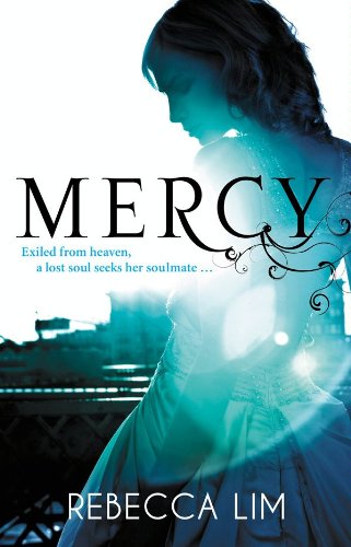
Last Week on FFO: Rebecca Lim's Mercy
Winnah ------>


I am loving the new cover for Delirium! I think I may like it even more than the original. I'll be buying a copy, for sure.
ReplyDeleteOld one. I often like the illustrated cover better than the people cover. Which is very Australian of my considering what our covers look like downunda.
ReplyDeleteIt's all about color for me. I think I would be more inclined to pick up the revamped version. It catches my eye more so than the original.
ReplyDeleteI like both of them, but if I really had to choose I probably will wait to see how the sequal is going to look like. ;) No fair!
ReplyDeleteThe second cover!!
I like the new one better - I think I find it more engaging. Oddly enough I read an ARC of this one that had a totally different cover (which I might like best of all!)
ReplyDeleteI love the new one! The old was OK, but the new one is GORGEOUS.
ReplyDelete(I would love to see the ARC cover lisa mentioned!)
Definitely the face.
ReplyDeleteI have the ARC, Ham. Personally, it's my least favorite of the three. You can see it in my teaser for the book.
ReplyDeleteI think I'm just used to the original cover...but the new one just looks like any other new teen book trying too hard. Original for me.
ReplyDeleteI like the original one
ReplyDeleteI like the original cover best. The new one is just FACE and I like that the old one is more of a secret, which I like.
ReplyDeleteI'm getting REALLY annoyed by this- Change the cover after the first in the series- thing... It's making me angry... :(
I seriously wish I had power over publishing companies because I really don't like them changing their minds so quickly. Sheesh.
ReplyDeleteI don't own Delerium yet so I will be getting the new cover as much as I do like the old one. I have Nightshade. I partly bought it for the gorgeous cover. I am so not thrilled at the direction their taking. I have to see if I can get my hands on a copy of an ARC for the new book (Wolfsbane?) because I believe it's art is in line with the first. I agree with Ashley, change the covers when you re-release the entire series, not before. Grrr-ARRRGH!
their is supposed to be they're...Blarg.
ReplyDeleteI like the original cover!!
ReplyDeleteI am not a fan of giant faces on covers.