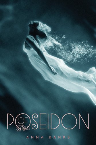
I have other covers that I've been seeing around that I think would make fine Face Off material against Jocelyn Davies' A Beautiful Dark OR Anna Banks' Of Poseidon, but these two I think work best. They are very clearly different covers, based on different pictures, but there's no denying the similarities. And I'm not sure how I feel about either. So how about you? Either of these inspire any cover love? Which one would you reach for in a store?
Which one did it better?
 Last Week on FFO: In what was almost a complete shut out, The Adoration of Jenna Fox pulled off a win over the puzzling cover of MetaGame (ha. ha.). Though to be fair, a number of you confessed you weren't a fan of either, or the puzzle piece faces in general.
Winnah ---->


I don't have particular love for either of the covers, but I do think they are both pretty & like Oooh- Shiny.
ReplyDeleteI think I like A Beautiful Dark because it looks more natural and less like... contortionist...
But I really like the font on each. :)
I like the OF POSEIDON cover better, for two reasons:
ReplyDelete1. The typography of the title is just gorgeous; I love the slim letters and the way they are put together.
2. The pose looks more realistic to me because the girl is underwater, instead of in the air. It's a natural pose for someone who is swimming (mermaid-style) through water, but I have no idea what the girl on the other cover is doing. Defying gravity?
Hands down Poseidon. I'm a sucker for water covers.
ReplyDeleteOf Poseidon! Because it's a mermaid. And mermaids win. :)
ReplyDeleteBoth are pretty, but I like Poseidon more.
ReplyDeleteA Beautiful Dark!!!
ReplyDeleteThe cover of Poseidon looks like a horrorbook. It's too dark and scary looking.
I'm not a huge fan of the dress for A Beautiful Dark, so I guess my vote goes to Of Poseidon. I think both covers are really pretty though.
ReplyDeleteI like Of Poseidon better. Firstly, I really love the font. Secondly, I like that it's underwater. It's very pretty.
ReplyDeleteOf Poseidon hands down!
ReplyDeleteno, a beautiful dark, hands down!
ReplyDeleteI really like a Beautiful Dark much more than the other cover!
ReplyDeletePoseidon for me. I love mythology and this one looks good! Beautiful Dark's pose just doesn't do it for me. Go Poseidon!
ReplyDeleteI like A Beautiful Dark more. Under water covers always make me feel like I'm drowning :P
ReplyDeleteI love the cover of OF POSEIDON. It's gorgeous.
ReplyDelete