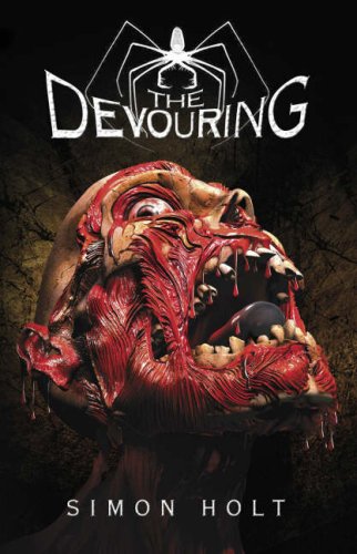
I mentioned the following covers for Simon Holt's The Devouring in this week's Book Chat on scary reads (and will be mentioning them again next week in the Chat for creepy covers). They are also covers that I've been meaning to feature here on FFO for some time now because they are such very different takes for the same book, and give such ... different impressions. I have a definite favorite, but that's without having read the book, so who knows what I'd think if I knew the story. But what about you? Which would you reach for on the shelves?
Which one did it better?
 Last Week on FFO: The hardcover and paperback versions of Clarity went head to head, and the paperback proved that sometimes a mid-series cover redesign is actually for the best: the more more suitable red-headed paperback cover won in a landslide, despite how similar both covers really are.
Winnah ------->
 |
| Click here to be taken to the Helluva Halloween Main Page! |


The first one is better, the one on the right is just disgusting! ;)
ReplyDeleteI actually love the cover on the right, I think the purple cover is too YA if you know what I mean. I guess though it would depend on the story because if it's more sad/drama then I'd say the purple cover but if it's more action/scary I'd say the right hand cover. What are the two different covers for? I have a copy of the purple one, but WOW that face-melty one is sooo creepy. I really like it.
ReplyDeleteI can't get around the fact that those two covers actually house the same book inside. I would never in my life reach for the second cover, although I would sweep the first(purple) one right off the shelf.
ReplyDeleteFirst! The 2nd scares the shapoopy out of me ;) No lie.
ReplyDeleteYou know, I like them both. My first instinct is the second one, but I've read the book and I'm not sure I think it fits exactly. Hmm.
ReplyDeleteOh my god the one on the left because the one on the right scares the pants off me.
ReplyDeleteThe one on the left. If I saw the other one at the store, I'd give that shelf a wide berth.
ReplyDeleteleft, purple rocks
ReplyDeleteDefinitely the left one. I don't know if I'd ever pick up a book that had that nasty cover. haha! ;)
ReplyDeleteDude! The second one is scary as SH*T!!!
ReplyDeleteI like the right, but it is a little off putting even though it's more accurate to the interior of the book. I have to say the purple because it's what draws more people in.
ReplyDeleteUmm, the one on the right is gross. Super gross. I wouldn't want to read that book. I'd feel gross every time I was picked up the book and accidentally stuck my hand on the nasty... :P Definitely the purple. It doesn't look as scary, but it's a little haunted/hunted looking, and I'll take that... :)
ReplyDeleteYeah i like the first cover a lot better the other ones just too like freaky i guess.
ReplyDeleteLeft one is my winner but I kinda like the right one.
ReplyDeletethe right one coz it scares the hell out of me so I'll pick that one lol :)) the left one is a bit to soft I think ;)
ReplyDeleteCan I just say how much I hate both?
ReplyDeleteAlso, pardon me while I barf after having looked at the one on the right.