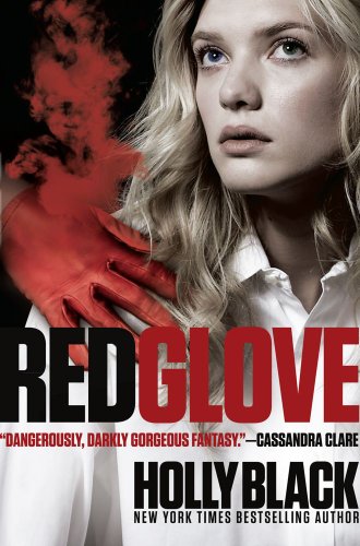
As I mentioned in my review for White Cat, this week's Face Off is for the covers of Holly Black's Curse Workers series (White Cat, Red Glove and Black Heart). Personally, I've always loved the covers on this series, so when I saw they were redoing them (before the series is complete! ugh!), I was a little bummed. I know that people-covers are overdone, and I know some people have pet peeves with obscured faces on covers, but for this I thought it really worked. The covers are a little unsettling, especially the first with it's supervillain white cat, and I loved that (even despite the whitewashing controversy). Unfortunately I think they've gotten more mainstream with each cover, so I guess they thought they needed a shake-up. Don't get me wrong, the new covers are neat - a really interesting design concept - and they are growing on me. Still...why can't they just effing wait for the reissues? So...
Which did it better?
 Last Week on FFO: Different editions of Flynn Meaney's Bloodthirsty went head to head, with the cheesy, goofy, absolutely adorkable "boy" cover vamping its way to a win.
Winnah ------->


To be honest, I prefer the UK covers (White Cat, Red Glove, Black Heart). But since they're not an option, I'll go with the original covers. I just don't like the style of the new ones.
ReplyDeleteI hate the new covers, they look bad. I like the original ones.
ReplyDeleteThe original covers, hands down. I also like the UK ones.
ReplyDeletePersonally, I wouldn't pick up the new ones for a second look.
Btw, I'm totally digging this new blog look of yours. It's pretty and clean.
The new covers are cool but not as cool as the people covers.
ReplyDeleteI love the original ones. They capture what the books are about. I'm not sure not the new covers really have to do with the book,
ReplyDeleteI didn't particularly like the original people covers (so much so I scoffed when the White Cat came out), but I like the new ones even less. (Well, actually, I like the Red Glove's new cover more than the people cover, but the others, I like the people cover more.)
ReplyDeleteSo all in all, I'm going with the original people cover.
Original. The new covers look too plain. I am very much against plain looking covers.
ReplyDeleteOriginal. The new covers look too plain. I am very much against plain looking covers.
ReplyDeleteI'm going with Ren on the UK versions but since those aren't options I'll go with the originals. The new ones look like 70s Bond covers or something. Just weird. I like the White Cat original but the last two not so much. UK covers are so great!
ReplyDeleteI loved the old covers so much...these new ones, not so much!
ReplyDeleteI wouldn't have minded if they'd decided to do the redesign for the paperbacks, but the fact that they changed the covers right before the last book is ridiculous, and I think it's actually kind of rude to the fans...now our books will never match if we have the hardcovers. Plus, even the second book was a slight redesign form the first, but I was okay with that because it was close, this change just bothers me. When I'm paying almost double for a hardcover I like them to at least match....you'd think publishers would've paid attention to how much the Nightshade cover change bothered fans...and that was just after the first book! Okay, my little rant is over. :P
I think the old ones depict the noire feel of the books so much better than the new ones. I also loved how much the gloves draw your attention, and I loved the people on the covers. Especially the fact that they were the SAME models, it's was neat seeing Cassel, then Lila, and then them together...but I guess we'll never get to see them actually on the cover together. :( The new ones are way too abstract for me, and the weird people formed out of dots kind of give me the creeps.
I really just wish they'd just kept the old covers at least until the hardcover of Black Heart came out. *sad sigh* Oh well, I guess. :(
I prefer the old ones a lot more! Great post,
ReplyDeleteJessica from Booked Up!
http://www.bookedupbloggers.blogspot.com/
:) xxx
The old ones are more fun. ;)
ReplyDeleteI have a soft spot for the original covers.
ReplyDeleteI'm different again. I prefer the new covers. The others are too CW show for me.
ReplyDelete