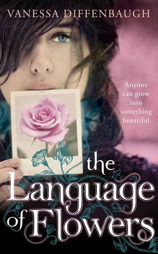
I have Vanessa Diffenbaugh's Language of Flowers sitting on my shelves, and as interesting as it sounds (to me, at least, because I am a nerdy gardener), I haven't got a clue when I'll actually get around to reading it. Part of it, I think, it's that the grayscale cover - which is what mine looks like - just doesn't draw me in. It makes me feel really blah, and that's not how I want to feel going into a book. But then I started looking around, and it actually does have some pretty covers. So, would you reach for any of these on the shelves?
Which one did it better?
 Last Week on FFO: Soul Bound and Sacrificial Magic went stock-photo to stock-photo, with Soul Bound winning by one.
Winnah ---->


Yes!
ReplyDeleteI know what you mean!
It's sooo blah.
I'm trying the audiobook right now.
Have you seen the paperback with the girl holding a hand full of flowers?
I definitely like the girl with the Polaroid of a rose best.
Ahhh, that's a toughie. I'm between the first and third covers. Something about the second seems too... meh. Must be because there are too many girls on covers for the YA genre these days. But I think I like the third cover best. The custom font & combination of black & red is quite lovely :)
ReplyDeleteHere's my cover comparison for this week! :)
+JMJ+
ReplyDeleteI'm most drawn to the third one. Red, black and white are so dramatic, and I like the composition of words behind and on the silhouette. It makes the other two covers look really ordinary.
Definitely the middle (pink) one. SUCH a pretty cover!
ReplyDeleteI actually think all three covers a very beautiful, but I'll have to cast my vote for the third cover. The bold colors, the fonts, the silhouette. It's much more bold and interesting than the other two covers.
ReplyDelete- Jackie
the2nd 1
ReplyDeleteThe one on the right. I think the center one loses for me, because it's more mainstream.
ReplyDelete