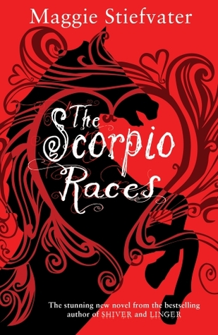
I recently came across what I think is the UK cover for Maggie Stiefvater's The Scorpio Races (right), and though, Yep - Face Off. I really couldn't tell you which of these I prefer more - or whether I prefer either; maybe I'll have more of an opinion on them once I've read the book. But my impressions, at least, are that the US stresses action and folklore, and the UK stresses romance (look at all those widdle hearts...). But other than that, it's a toss-up. So, which would you guys reach for? And if you've read it, which do you think suits?
Which one did it better?
 Last Week on FFO: The silhouette (US) and model-y (UK) covers of Sarah Rees Brennan's Unspoken went head to head, and much as I thought it would be, the silhouette's blew those 'shopped models outta the water!
Winner ---------->


I really like the UK cover better than the US since its brighter and colorful but the US cover isn't bad but just not to my taste also the typography on the UK is gorgeous
ReplyDeleteI strongly prefer the US cover. I haven't read the book, but FFO is about cover appeal, right? My impression is basically the same as yours. The UK cover looks... girly. Like a horse book or something. Even if I knew that's not what the author generally writes, I'm still no likely to be interested.
ReplyDeleteYep, absolutely about cover appeal - you can (and should!) vote on whether you'd pick the book up, whether you're curious to know more, which you'd rather have on your shelves, etc.
ReplyDeleteIf you happen to have read the book, you can decide based on which you think suits, if you'd like, but generally, it is purely FACE - an excuse to judge a book by its cover. =D
I think they are both appealing but I would probably grab the first one (US).
ReplyDeleteI love twirly, smoky embellishments on covers, but the fact that on the UK cover, they form a heart, makes the book look more middle-grade than YA - and I agree, very, very girly. Plus, I love the darker red of the US cover. I haven't read the book yet but I heard it is just as appealing to boys as it is to girls.
So...Both pretty, but for me, the left cover wins.
I like the uk better thank the us cover. I have the us cover but if I got to choose I would have the uk edition.
ReplyDeleteI too prefer the US one. For me the UK one looks like someone drew over the horse silhouette with a crayon...
ReplyDeleteI have the UK version (paperback). The scroll work wraps around the book and is shiny red & pretty. However I don't think the hearts look quite right :)
ReplyDeleteI would be very torn, but I don't like the hearts on the UK cover. They make it seem too girly. The US cover is something anyone could pick up. So I vote US.
ReplyDeleteDefinitely love the UK version with the hearts. The US version is just not that pretty to me.
ReplyDeleteI like the UK version since it seems more vibrant, but both appeal to me!
ReplyDeleteThe US cover is much better.The UK one looks like it's aimed at pre-teens. There's nothing wrong with that but it doesn't appeal to me.
ReplyDeleteI think I'd love the UK cover even more if those hearts were not there. They just don't fit, but I love the swirls and such. Hearts would have made it less girly though, I think.
ReplyDeleteI like the Uk cover!
ReplyDeleteI vote for the US paperback cover. I don't care if that's not an option! I'm writing it in!
ReplyDeleteWell, first off, I have to say my favorite is actually the new US paperback, which you don't have included.
ReplyDeleteBUT I really like both of these, though I do like the UK cover slightly more.
I was pleasantly surprised by this story of racing, carnivorous wild horses. I enjoyed the characters whose relationship didn't center on romance, although there was an aspect of it.
ReplyDeleteHighly recommended Bear Viewing