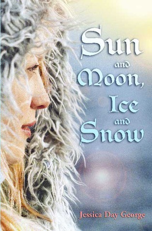
On her blog recently, Jessica Day George mentioned that a number of her books are getting shiny new covers! (Don't worry, this isn't a case of the dreaded mid-series cover change - these are all reissues.) Of course, I'm thrilled that they are reissuing her books and hopefully this means a bunch of new readers will find their way into her incredible worlds.
But of course, her storytelling is not what we're here to talk about. We're here to talk about the covers. Below you'll find the original US hardcover (which I had and cherished until it sadly went missing in Idaho...) and the upcoming US paperback. Previous paperback versions have had the same design as the original, but with minor alterations in the coloring of the font. But the new version takes a whole new approach. I'm definitely curious which one you guys like better. Me, I may just be partial to the one I had and loved, but there's something about the super-close crop on her face, the lighting and her expression that gives the perfect sense of the adventure and hopefulness of the story. It's simple, but it's striking and iconic. The second cover, though, I feel may pull a larger audience in.
So which would you reach for? Which makes you want to know more about the story?
Which one did it better?
Last Week on FFO: Snow White and Sleeping Beauty went head to head (or they would have, if they hadn't been in drugged comas...). You guys made some interesting pleas for why each should win, and while more of you chose Sleeping Beauty, I think Lex made a great point, which I want to share with you:
Sleeping Beauty may start out with a loving family, but she winds up alone and really only makes friends with her new man....However, Snow White makes new friends. She builds up a network of people who love and support her, wherever she winds up, and gets these people to defend her and think for her and go to bat for her.So there's some food for thought.
 |
| Click here to go back to the Fairy Tale Fortnight Main Page, where you can access the schedule! Or go here to get involved! Credit to these awesome Deviants for our button [ 1, 2 & 3]! |


I would go for the one on the right. It has more of a magical feel to me, and I like the size and type face of the author's name a lot better.
ReplyDeleteI've got the left one and I like it better because it isn't the usual type of cover. The right one doesn't do it for me. ;)
ReplyDeletei prefer the one on the right, i'm not really a fan of the face close-ups and the right one jsut has more of a fairy tale feeling to it wich i love.
ReplyDeleteThis comment has been removed by a blog administrator.
ReplyDeleteThe original. The new one looks cool, but it looks like too many other YA fantasy covers.
ReplyDeleteThe original. It just feels like what I was expecting for it when I read it. The new one looks too much like a stock photo stuck on a nondescript background.
ReplyDeleteI much prefer the original cover.
ReplyDeleteOriginal! The other one is just so generic to me.
ReplyDeleteHeather
I really like the new cover. The close-up on the face doesn't really work for me. (Though obviously it did entice me enough to buy it, even if I haven't gotten around to reading it yet.)
ReplyDeleteOriginal cover for me!
ReplyDeleteTo be honest, I don't care for either. Pastels don't really jump off the shelf at me, and I don't like the font.
ReplyDeleteI guess based on the picture though, I'd go with the one on the right. It says so much more and it seems a little magical.
- Jackie
Hmm... There's a trend in covers these days, to have less interaction with the reader. I could be wrong. But giving the reader a sense of place (or an invitation to partake in whatever the model/illustration is doing) helps to draw the reader in, so I'm always disappointed when a cover doesn't invite me to see what's up with this story/author. I think the new one (with the full body shot) invites a little more. Neither cover looks the reader in the eye, or makes the reader want to know what's "further up and further in." The new one comes closer to that, but the mystique of the older one is also unique.
ReplyDeleteI prefer the newer cover.
ReplyDeleteI much prefer the original. The new version looks like a hundred other modern covers, to me. It's pretty and all, I guess, but I value individuality.
ReplyDeleteI like the original cover better.
ReplyDeleteI know the contest is over but - I didn't know there was a new cover! I love the original cover because 1. I'm sentimental. And 2. I'm not sure about the new one. Part of me loves the snow and how magical it looks, buuuuut...then again, it looks so typical if YA covers. The original one has a uniqueness I love. Anyways, great pick for FTF!
ReplyDeleteSierra @ Yearning to Read