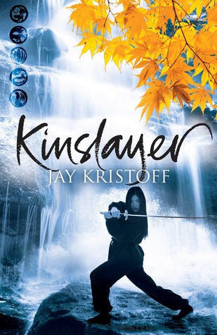
The covers for the second book in the Lotus War series, Kinslayer, were released this week (along with many a giveaway), and since we had a pretty lively discussion about the different versions of Stormdancer, I figured we should probably continue the tradition with Kinslayer.
Below are the US and UK/AUS versions of the book. They follow in the footsteps of their predecessors, with a strong, bold, fierce Jason Chan-designed piece of art on the US, and a more cool, calculating, muted design on the UK/AUS version. As before, there are elements I really like in both, so I'm curious to see which you guys would rush to pick up (if either). So tell us in the comments, which grabs your interest? Which would you want on your shelves?
Which one did it better?
 Last Week(ish) on FFO: I once again forgot to post FFO last week (I was out of town much of the week, so my brain was gone), but the week before, we had a Face Off between the original and updated covers of Elizabeth Eulberg's Take a Bow; though we all sort of have the feeling that the updated cover is probably more true to the book (the original looks rather drama-y, and not so much rock star-y...), that didn't stop the majority of you from choosing the original. And I can't blame you - it's so pretty!
Winner ------>


I love the US version! The awesome dragon in the background and the fact that the girl totally looks like she's going to kick your ass is fantastic.
ReplyDeleteI absolutely love the US one. I'd pick that one up in a heartbeat. UK one is just so-so. Interesting on its own but compared to the US one just doesn't compare, in my opinion :)
ReplyDeleteThe background of the UK/AUS version pleases me a lot; I love the color contrast of the cool water with the bright autumn leaves. But the heroine on the US cover has an appealing intensity. I wish I could combine them into the best of both worlds, but if I could only choose one...
ReplyDeleteI'd go US.
The US cover looks so COOL!. The model on the UK poster looks like she's just posing instead of actually fighting. And I don't like the leaves.
ReplyDeleteI prefer the US cover the green is pretty
ReplyDeleteOoOoOo....the leftmost cover looks much more badass. Also, a bit anime-esque.
ReplyDeleteLove the US version. While the color contrast on the UK cover is nicely handled, the figure not only seems to be posing, but feel pasted in. The US cover has the heroine as complete focal point for the viewer--love the intensity and the colors.
ReplyDelete