We've had Libba Bray's The Diviners on Face Off before, when the US and UK versions went head to head and gave us lots to talk about. But those two pretty covers are not the only pretty covers out there for this glorious beast of a book, and I have to say, the two covers I'm going to showcase today might just beat out both the US and UK as my favorites. Below are the Italian (love it!) and Australian (so cool!) versions of The Diviners. Take a look - and if you want, take a peak back at the US/UK versions, too - and then tell me in the comments which one you would reach for. Which makes you curious? Which has the better feel? Which gives you the best sense of story, and which would you proudly display on your shelves? In short,
Which one did it better?
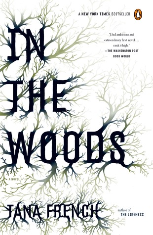
 Last Week on FFO: A couple of covers - Tana French's In the Woods and Lindsay Fairleigh & Lindsay Pogue's After the Ending - went head to head to represent the white background/black branchy-things trend. You guys had a lot to say about how this trend was implemented, and even had a few suggestions of other covers with similar styles, but in the end, more of you chose In the Woods.
Winner ---------->


I think my vote goes to Australia on the right. It's an intriguing take on the "faceless" cover trend.
ReplyDeleteThe Australian one is gorgeous :). I think it suits the book itself perfectly.
ReplyDeleteAustralian version.
ReplyDeleteOMG THE AUSTRALIAN VERSION - HOW CAN I GET IT IN THE US??? I really like all four covers... but the gold paint flecks; the old photograph look of the disembodied, lacy arms; the rich color in the tarot card; the font... PERFECT. I'm moving to Australia.
ReplyDeleteI love the font of the Italian version...the art deco type of style. Great covers though!
ReplyDeleteI like the Australian cover, with the Tarot card and disembodied hands. The Italian version looks like a vintage poster, to me- pretty, but doesn't give me a sense of compelling action or mystery. Also....why could they not call it "The Diviners"? That title is ridiculously long...
ReplyDeleteThe Australian version, no contest.
ReplyDeleteI like them both, but I'll have to go with the Australian version. It looks less cheesy and more original to me. I love all the elements of it, especially just seeing the arms.
ReplyDeleteI love the Italian cover hands down. Just so freaking gorgeous!
ReplyDeleteI like both covers, but I would be more likely to pick up the Australian copy.
ReplyDeleteThis comment has been removed by a blog administrator.
ReplyDeleteThe Diviners is a wonderfully authentic and creeptastic read. Libba Bray has crafted an intricate and fascinating paranormal world that parallels our own. I highly recommend reading this book as soon as you can get your hands on it. If you're an audiobook fan this one is pos-i-toot-ly divine!
ReplyDelete