I mentioned in a recent book haul that I had picked up Kate Forsyth's The Gypsy Crown on pure cover-appeal. Well, not totally pure cover-appeal, as the reason I was looking into it to begin with was that Renee interviewed Kate for Fairy Tale Fortnight, and made me want ALL TEH BOOKS!!1! But The Gypsy Crown was the only one in stock on Better World Books when I was a-shoppin', and though they had both of the first 2 version shown below, obviously I had to go with the middle book and it's gorgeous silhouettes. I said when I bought it that it would be in an upcoming Face Off, and then when I went to grab the images for it, I also came across another gorgeous cover, which is the 3rd seen below.
So, below we have 3 fairly different takes: traditional fantasy, classic understated and contemporary cool - take a look at the 3 covers below, and tell us in the comments, which would you reach for? Which one makes you curious about the story, and which would you rather have on your shelves? In short,
Which one did it better?
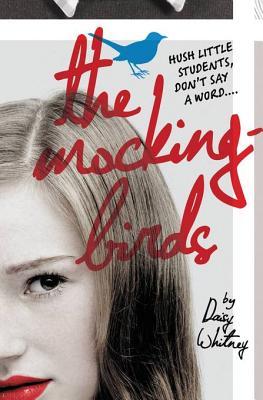
 Last Week on FFO: The original (sort of) and updated cover for Daisy Whitney's The Mockingbird's went head to head, and though you guys did have some issues with it, the publishers must have made the right call, because you guys went with the updated cover. [Mostly for that font, amirite?]
Winner ------------>


Ooooh, this is a tough one, because I actually really like aspects of all three of these! The one that MOST catches my attention though is the middle one (the one you have). I'm always really attracted to yellows and oranges, and I'm a fan of the silhouettes. There IS something about the one on the right though--I'd certainly pick that up if I saw it on a shelf as well.
ReplyDeleteThey're all three beautiful, but I guess I would have gone with the one on the left, I like the classic childrens book feel it has.
ReplyDeleteAll three are lovely editions, but I know right away I'd hunt the third copy down. I love the colors and lettering; it's gorgeous and a bit whimsical too.
ReplyDeleteOh this one's so tough! I guess in the end I would have to go with number 3 because of all the lovely colors, though I do like how striking the silhouettes are and the first cover just looks like and instant classic.
ReplyDeleteNumber 3 looks a bit too messy for my taste.
ReplyDeleteI like the lighting on Number 2, though I'm not generally a fan of orange.
All told, the classic illustrative appeal of Number 1 would probably be the one I'd go with (so much there for roaming eyes to see!), with Number 2 as a super close second.
Oh my goodness, #3 all the way. The others are pretty, but a girl galloping over a world? Totally intriguing. I'd pick up #3 instantly. :)
ReplyDelete#2 is pretty and I always love silhouettes, but #3 is my vote.
ReplyDeleteI like both the secodn and the third cover. I can't decide.
ReplyDeleteThe third one is pretty awesome! I'm a sucker for cool fonts like the one used for the title.
ReplyDeleteI'd go with the middle one. The third one is too cartoonish with the curly letters and the first one is too old-fashioned for me. I like the teaser at the top of the 2nd cover, the shadows, the glowing 'O' in 'crown' ... basically it wont chase away a male reader is what I'm saying :-)
ReplyDeleteThe Pedestrian Writer
It's generally quite easy for me to choose one of the covers but this time it's soooooo hard!!!
ReplyDeleteI like all three of them! But if I had to choose, I think I'll go for the last one. The colours are really nice and I love the opposites of day and night in each side of the Earth (is it the Earth?)
This comment has been removed by a blog administrator.
ReplyDelete