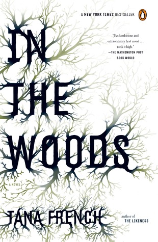
I've been seeing a LOT of these types of covers popping up lately - a stark white background with wispy black branches, veins, ice crystals, etc. This seriously could have been an endless Friday Face Off. But I chose just two examples: Tana French's In The Woods and Lindsay Fairleigh & Lindsay Pogue's After the Ending. I have to say, it is a trend that always catches my eye, so I can see why its become popular, from a design standpoint. But though these two are very similar, and give off similar vibes, they do have distinct-enough differences that one is more likely to stand out over the other to any given reader. So which would catch your eye? Which one makes you wonder what can be found between the covers?
Which one did it better?
Last week on FFO: The hardcover and paperback versions of Elizabeth Fama's Monstrous Beauty faced off, and you guys were pretty much split across the board. Some liked the fact that you couldn't see a face on the original cover (giving more potential for something "monstrous"), and some of you felt like the fact that the 2nd cover was less "mermaid" gave the book wider cross-over potential. You liked the font on one, and the light in the other, and some wished the original ARC cover had made it to publication. The winner on this one is anybody's guess, though the reactions certainly show why covers get changed, as each appeals in different ways to different readers...


Yay! I was hoping you'd post a FFO :)
ReplyDeleteI like the concept of the cover of In the Woods but I wish they made it look more organic - the font and the trees don't mix well in my opinion... If they had done something sort of like Beautiful Creatures or Unearthly with the font and then mixed that with the trees I think I would have loved it. I would probably be more likely to pick up After the Ending though - based on title appeal alone.
Yay! I picked up In The Woods initially because of the cover! I like it better, because its branches but also looks like veins/arteries. Something about that vagueness appeals in a very creeptastic way.
ReplyDeleteIn The Woods, definitely. Though it's really similar to Warm Bodies...
ReplyDeleteIn the Woods. The branches seem to grow out of the letters instead of the branches just being decoration.
ReplyDeleteI prefer the tree border effect of "After the Ending". It reads as cleaner, to me, than the font of "In the Woods", which I find reminiscent of old potatoes sprouting in the basement.
ReplyDeleteMmmm I would have to say In the Woods wins!
ReplyDeleteI love the red rimming on the title so I'll have to go with After the Ending.
ReplyDeleteI like them both, maybe In the Woods a tiny bit more.
ReplyDeleteI prefer After the Ending, it looks more finished to me. I honestly assumed Into the Woods was a self-pub for quite a while because it looks like something I could make in 5 minutes given a downloaded font on Gimp.
ReplyDeleteIn The Woods-I love that the design is incorporated into the title. It seems less plain to me.
ReplyDelete