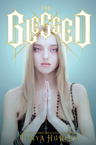
In my most recent book haul, I showed a copy of Tonya Hurley's The Blessed, which I mentioned buying on pretty much pure cover appeal. It's a cover that I know causes very different reactions - some people love it, and some people find it completely unsettling. Obviously, since I bought it, I fall in the 'love it' camp (and did I mention, it's reversible?!), but when I showed it in the haul, a couple of people mentioned that the book was being re-released with a completely new cover and title (Precious Blood)! Of course, I had to look into this and share it on FFO!
Take a look below at both the old (lovely, unsettling) cover/title combo, and the new, somewhat more generic, but also very intricate (and still sorta unsettling) cover/title combo - which would you pick up to find out more about it? Which would you rather have on your shelves?
Which one did it better?
 Last Week on FFO: Libba Bray's The Diviners came back for a 2nd Face Off, this time featuring the Italian and Australian versions. Both were utterly gorgeous, which, added to the US and UK versions, pretty much means I need to own every copy of this book because ZOMG SUCH GOOD DESIGN. Both covers got a lot of praise, but in the end, nearly all of you were won over (and very intrigued!) by those mysterious, tarot-wielding arms...
Winner ----------->


Ooh. Well I like the one on the right. The woman on the left gives me the heebie jeebies!
ReplyDeleteI LOVE how unsettling the one on the left is. The one on the right is...meh. Pretty in a painting sort of way, but tells me nothing about the book (although, with the new title I would guess vampire book). The one on the left's title tells me nothing but the girl on the cover is creeptastic, and perfect to what I'd imagine vampires to be (eerily pale, animalistic-esque features, red-rimmed eyes, etc).
ReplyDeleteI don't know. I guess I vote for Precious Blood.
ReplyDeleteLast time I was at B&N I saw this book (Beautiful Decay, I think) that was a paperback with a "butter cover" and I think that format would work really well for the new Precious Blood cover. But based on the digital images alone, I think I'd stick with the original. I definitely think making a new cover is a smart idea though, since the creepiness of the original cover isn't for everyone.
ReplyDeleteDefinitely the one on the left. The new one is ugly and generic.
ReplyDeletePrecious Blood is a better title, but Blessed has a better cover.
ReplyDeleteI have the re-released cover, but I love both covers equally. The illustration of the woman is really well drawn and I'm biased towards pretty art. On the other hand, the new cover fascinates me because of the intricate design. Ah, it's so difficult for me to choose just one!
ReplyDeleteWhy would they change the title?! And I'm definitely in the unsettling, give me a generic (but still intriguing) cover camp!
ReplyDeleteI would choose Precious Blood, the cover is less disterbing. I don't understand why they changed the title though.
ReplyDelete