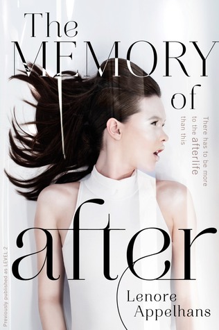
Browsing on Goodreads yesterday, I noticed a style departure between the first and second books of Lenore Appelhans' The Memory Chronicles series (Level 2 and Chasing Before, respectively). Intrigued by what prompted the change, I decided to look a little deeper and realized that Level 2 has been given a complete overhaul - not only has the style changed majorly, but even the name changed! Level 2 is now called The Memory of After. All in the span of a year, because "Level 2" was only released in January, and the redone paperback release just came out this month! BIG changes. Always fun to have on a Face Off.
So take a look at the 2 styles below. I'm going to include the synopsis for book 1 as well, so you can decide which you think suits the story better, but basically, which would you reach for? Do you like the cover/title changes they made? Does it make you more or less likely to read the books? Which would you rather have on your shelves, etc., etc.? In short,
Which one did it better?
In this gripping exploration of a futuristic afterlife, a teen discovers that death is just the beginning.
Since her untimely death the day before her eighteenth birthday, Felicia Ward has been trapped in Level 2, a stark white afterlife located between our world and the next. Along with her fellow drones, Felicia passes the endless hours reliving memories of her time on Earth and mourning what she’s lost-family, friends, and Neil, the boy she loved.
Then a girl in a neighboring chamber is found dead, and nobody but Felicia recalls that she existed in the first place. When Julian-a dangerously charming guy Felicia knew in life-comes to offer Felicia a way out, Felicia learns the truth: If she joins the rebellion to overthrow the Morati, the angel guardians of Level 2, she can be with Neil again.
Suspended between Heaven and Earth, Felicia finds herself at the center of an age-old struggle between good and evil. As memories from her life come back to haunt her, and as the Morati hunt her down, Felicia will discover it’s not just her own redemption at stake… but the salvation of all mankind.
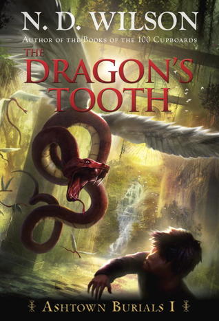
 Last Week on FFO: We had a middle grade adventure Face Off to suit my Fall cravings, with the original and paperback versions of The Dragon's Tooth going head to head. An overwhelming majority of us preferred the more action-packed and active paperback cover.
Winner ------------>


Well, I like the cover for "Chasing Before" best of all. And all the dots and the maze-like red font of "Level 2" don't appeal to me.
ReplyDeleteGuess that's a vote for the overhaul, then!
I like the one with the red writing better, it stands out more. I quite like the new white one, but the black one looks like a romance cover and the blurb makes it more thriller sounding, so I think the red writing cover fits the blurb better too.
ReplyDeleteI like the old cover style, but agree that "Level 2" isn't a great title. The redesign doesn't fit the blurb. It seems like a romance or fashion novel, whereas the first cover looks like she's cutting something in half with a sword or punching someone or doing some sort of actiony thing.
ReplyDeleteDefinitely new covers and new titles!
ReplyDeleteI like the old cover but with the new name.
ReplyDeleteHrm. I think the newer covers are more feminine and polished-looking, but the new covers also look High Fashion to me, not SciFi at all. Something about the old cover's photo makes the girl look a little alien, and even though the dots and font are a little juvenile, they honor the blurb better.
ReplyDeleteThe new titles are more intriguing...I wish they could use the new titles but give the covers a more sci-fi/futuristic bent.