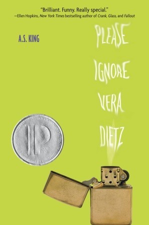
Take a look at the two different versions of this Printz Honor book (among many other accolades), and tell us in the comments which cover draws you in. Which appeals to you more, and makes you curious about the story? Which would you rather have on your shelves?
Which one did it better?

Last Week on FFO: Two books with similar covers (gray with a circular maze-like focal point) went head to head, and most of you were won over by the gray/baby blue color scheme of Aimee Carter's upcoming Pawn, leaving the very popular Legend in the dust.
Winner --------->


Hmm. I like the one on the left more. I haven't read the book so I can't say I know which one is new and which one is the original, but the left one draws me in more. I don't like the font or the colours of the one on the right.
ReplyDelete-P.E. @ The Sirenic Codex
I love the original cover. The paperback is fine, but generic.
ReplyDeleteThe original cover. It looks more original.
ReplyDeleteI love the right one, the other looks too non-descript to me.
ReplyDeleteLol I agree with Alessandra. I actually just read this last week and the original cover definitely fits it better even though it's not detailed. The new one looks like chick lit, which it is not at all
ReplyDeleteI think the original cover is more memorable, like you said. It makes me want to know what the book is about. The paperback redesign just blends right into the young adult shelves.
ReplyDeleteThe green one is definitely better. It reminds me of the original cover of Looking For Alaska by John Green. This cover makes me think it's about a volatile,troubled girl whereas the second looks like a romance novel about a girl who feels invisible in high school.
ReplyDeleteI actually have no idea what it's about!