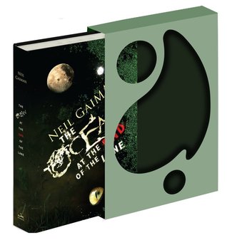
So... I may have forgotten to post an FFO last week, but 's ok, I've got a pretty cool one this week. As if I didn't want The Ocean at the End of the Lane enough as it is, the publishers recently released a limited edition deluxe copy, in a slip jacket, that looks super cool in or out of it. My grabby hands are a-itchin', friends.
But that's not to bias you, of course. This FFO is the same as always - take a look at the two cover options below and tell us in the comments which version you'd rather have. Is the deluxe edition a little to weird for you? The original a little too adult contemp? Let us know and vote for your faves in the comments by telling us
Which one did it better?
Last time on FFO: I confessed my recent obsession with Rosemary Clement-Moore, and her latest book, Spirit & Dust showed us what it was made of. We ended up split on which was the favorite cover, though there were complaints and loves about both. In the end, regardless of the cover, my advice would be to just pick up something by RCM.


Original cover. I like the colours.
ReplyDeleteOriginal cover wins for me. I had not seen the new one until this post.
ReplyDeleteI'd go with the deluxe edition. Slip covers are sweet, and I've seen a recent glut of people-floating-in-water covers that, while really cool images, got old to me. Plus, I like me some weird.
ReplyDeleteI think they both rep the book pretty well. The new one is a little more fitting for the child protagonist and his adventures but the original has kind of an alluring look that somehow matches the book on a less obvious level. Plus I love the back of the original and I'm pretty sure it's actually NG as a kid (I think) so my vote is for that one :)
ReplyDeleteAs much as the deluxe edition looks epic, I think I prefer the original cover a bit more :)
ReplyDeleteI'm honestly tired of the "people under water" trope on covers....the original immediately makes me assume magical realism YA novel. The second is somehow more menacing, and I really like that horizontal perspective trick they did with this one. The second cover, definitely, gets my vote.
ReplyDeletei really like the deluxe edition it so inviting that i want to read even though i would read it anyway since its neil gaiman
ReplyDelete