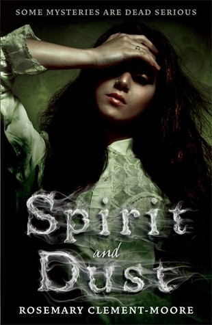
I just finished reading (and loving!) Rosemary Clement-Moore's Texas Gothic, thanks to all of you who voted for it in last month's Halloween-themed Stack of Five. When I started reading it, a friend on Goodreads mentioned that there was a second book, which I wasn't aware of, so of course I went to check it out - and what did I find there, but a perfect case for FFO! Below are 2 different covers for the sequel, Spirit & Dust. The first cover's dramatic, ethereal cover follows the theme of TG's cover (though I'm not sure how much they suit the style, much as I love 'em), and the second cover, though banal on first glance, should be clicked to view in a larger size, for a little surprise in the design... Take a look at both, and then let me know in the comments which you would reach for to find out more. Which would you rather have on your shelves?
Which one did it better?
 Last time on FFO: It's been a couple of weeks since our last face off, but it was a good one, since it went along with a giveaway... ;) Three different versions of How to Be a Good Wife, the thriller-debut of Emma Chapman, went head to head (or head to door to butterfly-in-a-wineglass, I guess...), and though they're all intriguing representations of the story, the ominous closed door won in the end.
Winner ------------->


I prefer the paperback. The hardcover is pretty, but makes it look historical.
ReplyDeleteLove the first cover, love this atmosphere of Gothic Horror it creates.
ReplyDeleteThe second is meh, looks too much modern Urban Fantasy to me (which may befit it better than than the other design, wouldn't actually know), the font looks a lot like the British versions of the Kitty novels, overall it's just rather bland IMO.
I really like the first cover better, especially with the font used. Creeptastic! Although the model on the cover looks like she's got a headache in a dark room, the second one's "person reflected in an iris" is nothing new and even more confusing as to genre or story. So, in essence....creepy fonts win! :)
ReplyDeleteI don't like either of them tbh. I think both designs are a bit lazy but if I had to I'd choose the second cover.
ReplyDeleteI love the one with the eye, but I prefer the font of the first one! Hmmm though I'd probably go with the eye one if I was picking it up in a bookstore. :3
ReplyDeleteAnd I am desperately holding out for the first cover, even though it means my formats won't match! Looks like we're tied, folks! =D
ReplyDelete