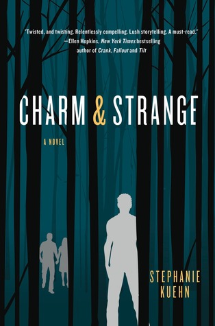
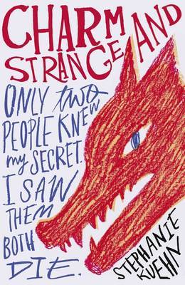
Earlier this week, I shared an excerpt with you of the recent William C. Morris award winner, Charm & Strange by Stephanie Kuehn. I know I'm not the only one who's very intrigued by this book, but I'm just as intrigued by its covers! I'd be seriously hard-pressed to tell you which I prefer, because as much as I love the cover on my version, the US hardback (left), I equally love the UK hardback and paperback versions (middle and right, respectively); they're all a little dark, a little edgy, and a lot off, and each makes me curious about the story inside. So I think this is going to be a difficult one for us this week, but take a look at the 3 covers below, read the synopsis and listen to the excerpt if it helps you decide, and then let us know in the comments which one you prefer. Which do you think suits the book best? Which would you rather have on your shelves?
Which one did it better?
When you’ve been kept caged in the dark, it’s impossible to see the forest for the trees. It’s impossible to see anything, really. Not without bars . . .
Andrew Winston Winters is at war with himself.
He’s part Win, the lonely teenager exiled to a remote Vermont boarding school in the wake of a family tragedy. The guy who shuts all his classmates out, no matter the cost.
He’s part Drew, the angry young boy with violent impulses that control him. The boy who spent a fateful, long-ago summer with his brother and teenage cousins, only to endure a secret so monstrous it led three children to do the unthinkable.
Over the course of one night, while stuck at a party deep in the New England woods, Andrew battles both the pain of his past and the isolation of his present.
Before the sun rises, he’ll either surrender his sanity to the wild darkness inside his mind or make peace with the most elemental of truths—that choosing to live can mean so much more than not dying.
 Last Week on FFO: Two striking versions of Patrick Ness' The Crane Wife went head to head, and though many of us liked both (or liked aspects of both), the whimsical paper-crafting style of the US edition won out.
Winner ------------>


The U.K. Hardcover is soooooo creepy. I love it.
ReplyDeleteI second this. Cover #2 is definitely one that'll stay with me.
Delete#1 strikes me as just so-so, while #3's scribbled style doesn't suit my taste at all.
This comment has been removed by a blog administrator.
ReplyDeleteLove the middle one, but probably only right up to the point where I pick up the book and find out that it isn't a werewolf novel at all.
ReplyDeleteI like the second/middle cover best. The empty round eye sockets are arresting and startling, and then when you notice the human/wolf profile crossover it's even more engaging. The first cover is too vague to give me a sense of the genre or theme of the novel, and the second one (while unique) looks very young. Like a third-grade drawing with crayons.
ReplyDeleteCover #2, though....I'd pick them up in an instant.
Well if I was going for disturbed and unreliable as the tone #3 gets my vote. When it comes to art therapy to express what is going on inside the mind, that one screams red flags.
ReplyDeleteI'm going with #2. I too like the crossover imagery, and the frenetic drawing and type font that suggests this to be quite an unsettling story. (Cover #1 is great in a more subdued way. #3 is a little too raw for my liking).
ReplyDeleteI like the third cover - UK paperback.
ReplyDelete