I generally don't get political and pick a side when it comes to FFOs because I don't want to bias you, but this Face Off has me feeling a little grumbly. There are plenty of cover look-alikes out there, and even more that use the same stock photo, so they can't help but invite comparison. I mean, we've had them on FFO time and time again. But this one... I can't help but feel that this is more than your run of the mill cover similarity. No, I can't help but feel that the cover for Broken Worlds is a blatant rip-off of the cover for Josin McQuein's Premeditated.
Don't get me wrong, good ideas are "borrowed" all the time, and we've all been in a bookstore and seen vast swaths of shelf space where all the covers look the same. But the cover of Premeditated is such a strong one — and one that stood out from the pack — that I can't help but find it a little...odd when an indie (self-pubbed?) book, which is coming out nearly a year after Premeditated (and thus, quite a ways after Premeditated's cover was released), has a strikingly similar uncommon approach to cover design...
But hey, maybe you feel that imitation is the sincerest form of flattery,* right? Let me know in the comments what you think of these two covers, and which — if either — you'd reach for on the shelves.
Which one did it better?
*You may believe that, but when my 2nd grade teacher told me that to get me to stop freaking out about the fact that everyone was copying my idea for our dream house project, my answer was not a favorable one... ;)
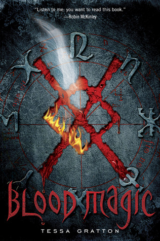
 Last Week on FFO: The hardcover and paperback versions of Tessa Gratton's Blood Magic Faced Off, and though for the most part, we all really liked both covers, the paperback (which was praised for being gender-neutral and arcane) won out over the slightly girlier, more "elegant" dead-girl design of the original.
Winner ------->


Premeditated looks better with the eye as the only distinct part of the. Face and everything else blurred out. The face in Broken Worlds looks almost lie it's superimposed on the glass.
ReplyDeletePremeditated is better IMO :)
ReplyDeleteI have seen Broken Worlds on netgalley a couple of times, I've actually thought it was the sequel up until know (never looked on author's name)..
ReplyDeleteBut I think Premeditated looks WAAAAAY better, Broken World looks fake
Premidated is cleaner, more compelling, and generally better...regardless of it being first. So uninspired immature graphic design spasms toward a comprehensive cover gain this indie nothing.
ReplyDeletePremeditated looks better.
ReplyDeleteOh, it's Premeditated all the way. There's much more mystery, with the blurring of the facial details except for that one eye. And I also like the way the hole in the glass goes off of the edge of the cover. Pretty cool. I'm embarrassed for the other cover!
ReplyDelete