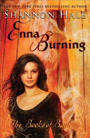
I'm kind of amazed I have featured Shannon Hale's Books of Bayern series (aka The Goose Girl, et al) on Friday Face Off before. I've long commented on the differing designs, and for awhile, when it was just the top (hardcover) and middle (paperback, 1st release) sets, I was very adamant on which I preferred. In fact, I've been meaning to replace my paperback edition of the 2nd book with the original hardcover, and then complete the series. BUT THEN, they released the UK paperbacks (bottom), and though I still looooove the original cracked-oil-painting style of the hardcovers, the new versions are just so damn pretty!
So now I turn the debate over to you. Which versions would you reach for on the bookstore or library shelves? Which would you rather display on your own shelves?
Which one did it better?
I would strongly suggest click on the books to enlarge them, to get a better sense of the style, since they had to be itty bitty to fit.
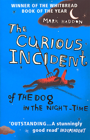
 Last week on FFO: Mark Haddon's The Curious Incident of the Dog in the Night-Time went quirky-to-creepy-to-oddball cover, and we pretty much unanimously agreed that the 2nd cover — aka "The Pitchfork" cover — was the clear winner. It's an arresting image that actually speaks to the book, and it would stop us in our tracks, until we found out just what that book is about...
Winner ------>
And Mark agrees:
 | |
|


I really like the people on the covers. They just add to the beauty of the 2nd covers.
ReplyDeleteOMG the first is so pretty and stylized and different! I love the third set, too, with the colors and the sketchy goodness.
ReplyDeleteThe second set is so...middle grade. And overdone. I get that it visually conveys these are YA books with YA main characters, but I much prefer when a book cover is more like actual ART, and engages me in the scene.
AH! I can't decide between them! Can I vote for both 1st set and 3rd set??
i prefer the second set definitively
ReplyDeleteI prefer the first set because it screams fairytale/fantasy in my opinion. Plus I kinda of dig the retro feel.
ReplyDeleteThe second set is the set I have seen the most and the people on them just don't invite me. Plus the models on River Secrets look like Peeta from THG and Sansa Stark from GOT, while the model on Forest Born looks like Emma from Degrassi.
The third set is nice but the colors are too neon for me. It makes my eyes hurt.
This comment has been removed by the author.
ReplyDeleteI've read each of these books at least three times, with the exception of Enna Burning........which I've read probably close to ten times.
ReplyDeleteI own all four of the second set, so I'm very attached to them! But I think that the first set conveys the most about the books and the series, mostly because the illustrations are taken from direct scenes out of the books. So I would say that I prefer the first set, but the second set will always have a special place in my heart c:
The new set is pretty, but doesn't fit the tone of the series, or really give the reader any idea of what to expect.
ALSO: I sent the link over to Shannon on twitter, and people have been talking about it over there as well: https://twitter.com/haleshannon/status/459770919448113153
First set. Love the painting style
ReplyDeleteI am a fifty-five year old man and I love these books. But I don't think I'd have picked up Goose Girl if it had had the second or third covers to begin with.
ReplyDeleteThe second set is so obviously designed to sell to young girls and the third set looks like a bunch of doilies and brings Mary Balogh to mind.
I love the first set and my daughter likes the third set.
ReplyDeleteThe original illustrated set (top) by FAR. Those covers are perfection. Also, I didn't know Forest Born had one, and I now want to hunt it down.
ReplyDeleteI found mine on Amazon
DeleteThe 1st set is a little old-fashioned, which I think is a big plus for timeless fairytales. (I particularly like the "Forest Born" cover. Such a work of art!)
ReplyDeleteThe 2nd set does not appeal to me. Too over-trendy. Pretty, but not special.
The 3rd set is also quite pretty, but I don't feel it fits a fairytale series nearly as well as set 1 does. It might make great wallpaper or graphic tees, but book covers? I don't think so.
My clear winner: Set #1.
I love the first set.
ReplyDeleteI prefer the center collection with people on the covers. If I were buying them, I would want those.
ReplyDeleteI do not like the neon color-splatter ones on the bottom at all.
The top set is OK, but nothing spectacular.
I am hesitating between the first and third set.
ReplyDeleteIn the end I think the first set fits better with the fairy tale theme. so I would vote for Set ONE
I like the first set better. The third set is pretty too but it is still a bit simple when compared to the first one.
ReplyDeleteFirst set. I love the painting style they went with!
ReplyDeleteI love the first set! The third is great too but the colors are a bit too bright.
ReplyDeleteYes i am totally agreed with this article and i just want say that this article is very nice and very informative article.I will make sure to be reading your blog more. You made a good point but I can't help but wonder, what about the other side? !!!!!!Thanks Best Face Painting Kits
ReplyDelete