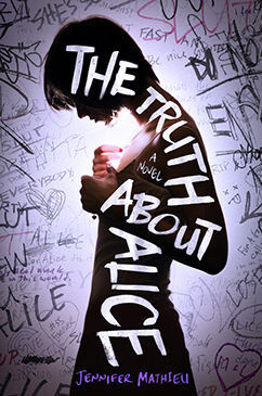
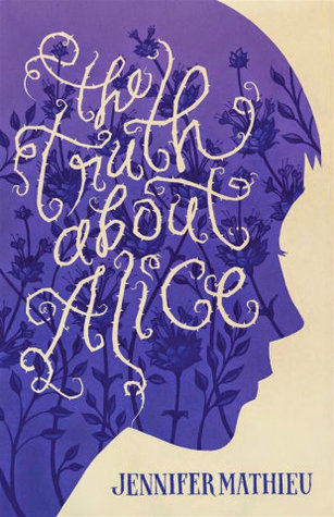
We've had Jennifer Mathieu's debut novel, The Truth About Alice, on FFO before, in a combo face off / cover reveal, when the final US cover went up against the temporary (but still very nice) ARC cover. But because those aren't the only options for Alice — and because I quite like all of Alice's many faces — we're going to have a round 2! The winner of the first Alice face off (the US hardcover) is going to try to defend its win today against the cover for the UK/AUS version of the book. Take a look at both below, and then let me know in the comments, which one do you prefer? Which would grab your eye on the shelves and make you more curious? Which would you rather display on your own shelves? If you've read it, which do you think suits the book more?
Which one did it better?
 Last Week on FFO: Two dead-eyed girls-in-grass, via All Unquiet Things and Kisses and Lies, went head to head, and the overall hella-creepy vibe of All Unquiet Things snagged it a win.
Winner ---------->


I like the UK version better. The US cover looks too depressing for me. I don't like depressing books.
ReplyDeleteI must admit neither one does it for me, but the left hand version wins by sporting a more readable title, though the pose of the girl on the cover feels off... it makes me feel uncomfortable; which probably fits the novel (which in turn probably means the book ain't for me :)).
ReplyDeleteThe one on the left is much better in my opinion. It grabs me much much more. And from everything I know about the book it seems to fit it better. The one of the right almost makes it look like it's for younger kids and I know its not at all!!
ReplyDeleteAs cute as the second one is, my preference is for the first (lefthand) cover. It seems less whimsical and fairytale-esque, and I love that the gal on the cover is skinny and flat-chested (which you don't often see represented in YA cover art).
ReplyDeleteDefinitely the one on the right. I love the purple, and the thorny text. Now, I don't know what the book is about at all, so I'm just going with the visual impact.
ReplyDelete