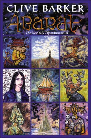
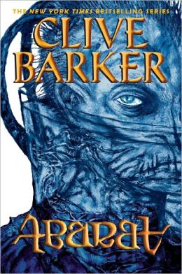
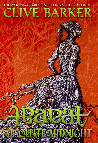
Alright, it's been aaaaaages since we've had a proper Friday Face Off, but I said they were coming back this year, and (for the time being, at least) I meant it. And we're going to start it off with a series overhaul that I came across recently, which is...eye catching, to say the least. I'm talking about Clive Barker's Abarat series, which has gone from colorful multi-pictured, almost playing card-style covers to monochromatic and startlingly creeptastic in cover design. Both have their weird elements, which I'd imagine suit the story (don't know, haven't read), but though I'm not sure how I feel about the current design — which I'm guessing is a permanent change, as the 3rd book has only that style available — I will say, one of them is definitely more likely to catch my eye. And maybe give me nightmares, tbh.
But what about you? Take a look at the two cover styles below and let me know in the comments which would catch your eye. Which would you be curious about, which would you be more likely to pick up, and which would you rather stock on your own shelves?
Which one did it better?
Previously, on FFO: Honestly, who even remembers; it's been ages! BUT, I may not have a winner to share with you, but I do have a plea for help -- if you see something that should be on Face Off, let me know! I only come across so many books, and I like to keep it diverse, so if you see a book or series that has had a cover change, has drastically different editions available, or even a stock photo used for multiple different books, please let me know, and I'll try to include it in a Face Off!


I think I prefer the bottom one. It's extremely creepy, but I like it. It's very cool.
ReplyDeleteI'm going to say that I like the bottom ones better because of the way they look together as a series. I remember when these came into the bookstore that I worked at and had to have a looksee. They were rather heavy because of the paper stock and the many full color illustrations (not sure if those editions are still out there) that were all done by Clive Barker himself. Creepy indeed!
ReplyDeleteHonestly, I don't care for any of them. The top ones are too busy for my taste. And the bottom ones...I don't know. Nothing about them grabs me =(
ReplyDeleteThe bottom middle is the best one but I don't like any of them to be honest.
ReplyDeleteAaaaah I haven't commented in one of these for so long!
ReplyDeleteOk so, I think the first ones have too many elements in them but the other ones are really creepy for me so I don't know if I would ever pick them up, actually.