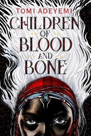
- My love of design, and specifically bookish design, runs deep. The tiniest detail can be make or break for me, but man, do I love those tiny details.
- I don't feature book design nearly enough on this blog anymore.
- I really, really want to.
And though I've always meant to incoporate design discussions in more posts, I've always had this weird little negative voice in the back of my head that tells me "You can't do that" if it's not something substantial, like some of the design-based Book Chats. But I CAN DO THAT.
I CAN DO THAT, VOICE.
So from here on out, I want to just feature some of my favorite book designs, pore over all of their intricacies and the things that make them so good, and hear your thoughts on the same, in a new series I'm -- aptly -- calling Cover Love.
And we'll start today with a recent love, and one that's on my most-anticipated list for 2018:
I mean, just. . .
Just look at it. My god. So simple, so striking.
Rich Deas' art is just... *kisses fingertips* PERFECTION.
I'd love to know your thoughts! Do you love it? Hate it? Seen one that's very similar? Let me know in the comments!
I'd also love to hear about some of your favorite covers -- you may be seeing them in an upcoming Cover Love post!
about the book:
Zélie Adebola remembers when the soil of Orïsha hummed with magic. Burners ignited flames, Tiders beckoned waves, and Zelie’s Reaper mother summoned forth souls.
But everything changed the night magic disappeared. Under the orders of a ruthless king, maji were targeted and killed, leaving Zélie without a mother and her people without hope.
Now, Zélie has one chance to bring back magic and strike against the monarchy. With the help of a rogue princess, Zélie must outwit and outrun the crown prince, who is hell-bent on eradicating magic for good.
Danger lurks in Orïsha, where snow leoponaires prowl and vengeful spirits wait in the waters. Yet the greatest danger may be Zélie herself as she struggles to control her powers—and her growing feelings for the enemy.
BTW, did you know you can read a sneak peek of this one? Because Amazon informs me that you can.
*Do we miss FFO? Do we want it to come back?


I'm glad you talked down that voice that said 'don't'. Because, while I don't like a review rating to reflect a cover since authors don't always control that, I do love to hear and see discussions of covers.
ReplyDeleteThis is a book I am planning to read and oh yes, I do love that cover. Her white hair is a big part of her story and I love the expression on her face. I think they did a fab job of matching cover to story and getting readers' attention.
I'm so glad that there are plenty of people out there that are as willing to discuss COVERS as much as the book themselves, like I am. Kinship!
DeleteAnd yes, they did a fantaaaastic job on this one.
This cover is absolutely stunning. I too am a sucker for a good cover and am so glad you have started this new series. Covers most definitely deserve some cover love. This may be a dumb question, but do you know how to find out who the cover designers are? I think it would be great to feature the artists/creators when lovin' on the covers. 😄
ReplyDeleteIf you can get your hands on a copy, cover artist and cover director are usually listed somewhere in the front of back flap. In this case, it's Rich Deas; I've updated the post to reflect that!
DeleteI now have to buy my books on kindle as I am going to be living in a camper and traveling. But I am a sucker for a beautiful cover. They are very pretty when you are scrolling through. Do miss physical books though.
ReplyDeleteI love it- I'm a huge fan of contrasts, and the shading is superb. Not to mention the color intensity. *le sigh*
ReplyDeleteIt also sounds like it'll be a great read. I need to know who the artist that did this is.
Agreed across the board! If I can find out who the author is, I'll update the post!
DeleteAnd by author, I mean artist! Doh.
DeleteHeeheee....yes, please!
Delete